It’s always nice to see your work out in the wild.
The Rise and Rise of AI visualisation from IIB, made with VizSweet — the project I was working on as Tech Director until my recent return to freelancing — appeared in my LinkedIn feed a few days ago and I thought I should do something celebrate all the work and love that went into it.
It was made using VizSweet’s Scatter plot module — the most complex, development-heavy module of them all, even though the outputs are strikingly simple. But what made it such an intensive build?
In a word: flexibility.
Most data visualisations work with a fixed set of data, where the data at hand is a known quantity. Simple, right? You work with the data, and get to know it, and it becomes a friend. You know how many rows there are, the largest and smallest values, the number of categories, which cells are blank and where the inconveniently long labels are.
But VizSweet was designed to handle any data set that customers could upload, automatically, without us even laying eyes on it. We couldn’t rely on assumptions about what the data would look like, how wide or deep it was, what state it might be in.
Scatter Plot has to handle all data-sets — the good, the bad, the unexpected — by being flexible, resilient and customisable.
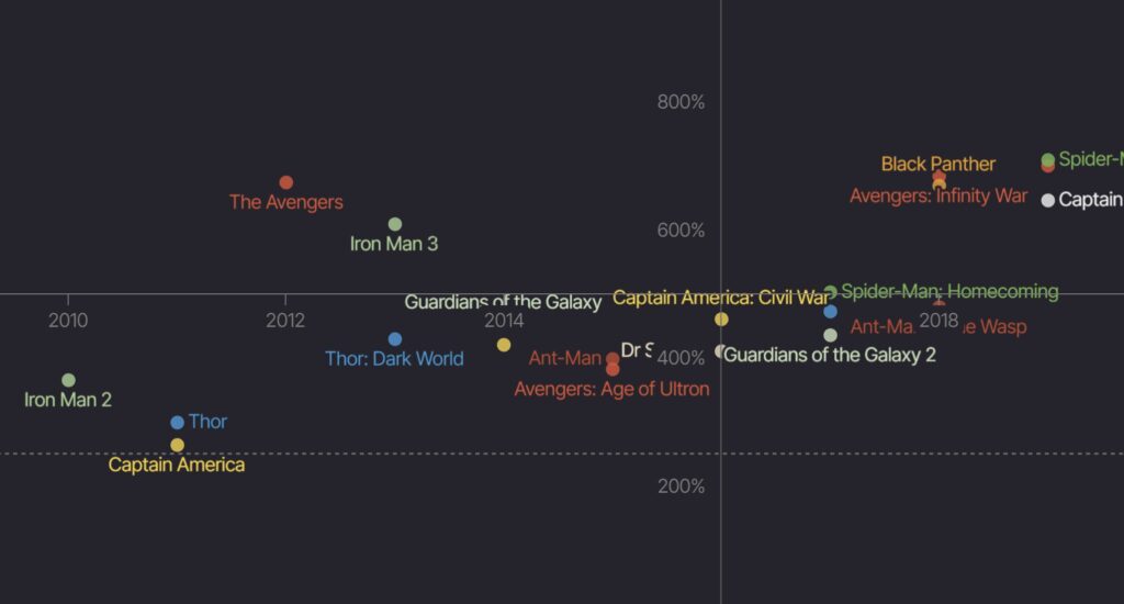
📈 Take the humble Y-axis. When you’re building a viz with known data you can basically draw a line from min to max and bang a few labels on there — not so with an unknown data set. The Scatter Plot module needs to intelligently manage the range of values in the data, bearing in mind that it might be a column of strings, or dates, or percentages, or years, separated by billions or less than one. They might be negative values, or might cross over zero. They might be the same value, or one end might not exist at all.
🗨️ Now add tick marks, both automatic and manual. Arrows. Titles, subtitles, layouts and alignments.
🎯 Data points, in their infinite variety.
🏷️Labels! The hours we spent crafting the labelling system, refining the type measurement system and placement algorithms to balance information with clarity.
And the irony is: if all of that is done right, then no-one notices.
When you create a visualisation with VizSweet, all this stuff happens quietly in the background. Data is assessed and formatted, scales are calculated and ticks created, labels intelligently placed to maximise the data-y goodness, and the first thing you see is an awesome viz — something you could use as a showpiece right off the bat.
It looks effortless — but it wasn’t!
I hope the work speaks for itself… but sometimes it needs a little nudge to speak up 😄
Leave a Reply